Tag Archives: off-screen

Beeing the off-screen king

Recently Torben and I spammed the “International Conference on Human-Computer Interaction with Mobile Devices and Services” (better known as MobileHCI) with two papers and a poster about off-screen visualizations. Off-screen visualizations try to reduce the impact of the immanent size restrictions of mobile devices’ display. The idea is that the display is just a window in a larger space. Off-screen visualizations show where the user should look for objects located in this larger space.

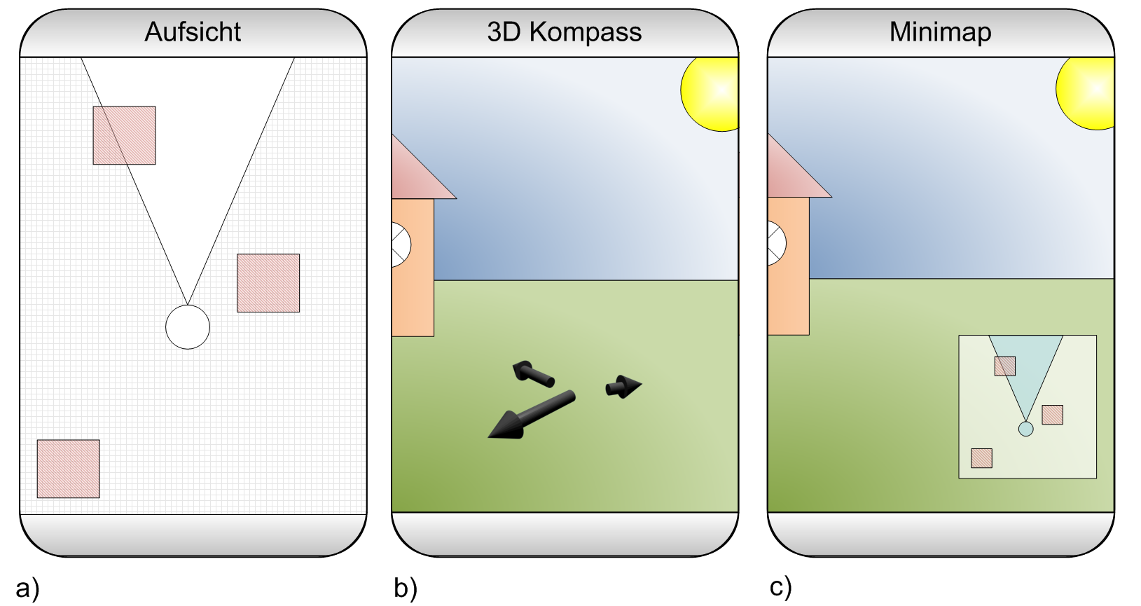
The title of the first paper is Visualization of Off-Screen Objects in Mobile Augmented Reality. It deals with displaying points-of-interests using sensor-based mobile augmented reality. We compare the common mini-map that provides a 2D overview about nearby object with the more uncommon visualization of nearby objects using arrows that point at the objects. The images below show both visualizations side-by-side.

off-screen visualizations for handheld augmented reality

To compare the mini-map with the arrows we conducted a small user study in the city centre. We randomly asked passersby to participate in our study (big thanks to my student Manuel who attracted 90% of our female participants). We ended up with 26 people testing both visualizations. Probably because most participants where non tech-savvy guys the collected data is heavily affected by noise. From the results (see the paper for more details) we still conclude that our arrows outperform the mini-map. Even though the study has some flaws I’m quite sure that our results are valid. However, we only tested a very small number of objects and I’m pretty sure that one would get different results for larger number of objects. I would really like to see a study that analyzes a larger number of objects and additional visualizations.

In the paper Evaluation of an Off-Screen Visualization for Magic Lens and Dynamic Peephole Interfaces I compared a dynamic peephole interface with a Magic Lens using an arrow-based off-screen visualization (or no off-screen visualization). The idea of dynamic peephole interfaces is that the mobile phone’s display is a window to a virtual surface. You explore the surface by physically moving your phone around (e.g. a digital map). The Magic Lens is very similar with the important difference that you explore a physical surface (e.g. a paper map) that is augmented with additional information. The concept of the Magic Lens is sketched in the Figures below.

handheld augemented reality with paper mapsConceptual sketch of using a Magic Lens to interact with a paper map.

We could measure a difference between the Magic Lens and the dynamic peephole interface. However, we did measure a clear difference between using an off-screen visualization or not. I assume that the impact of those off-screen visualizations has a much larger impact on the user experience than using a Magic Lens or the dynamic peephole. As the Magic Lens relies on a physical surface I doubt that it has a relevant value (for the simple tasked we tested – of course).

As some guys asked me why I use arrows and not those fancy Halos or Wedges (actually I wonder if someone ever fully implemented Wedge for an interactive application) I thought it might be nice to be able to cite my own paper. Thus, I decided to compare some off-screen visualizations techniques for digital maps (e.g. Google maps) on mobile phones. As it would’ve been a bit boring to just repeat the same study conducted by Burigat and co I decided to let users interact with the map (instead of using a static prototype). To make it a bit more interesting (and because I’m lazy) we developed a prototype and published it to the Android Market. We collected some data from users that installed the app and completed an interactive tutorial. The results indicate that arrows are just better than Halos. However, our methodology is flawed and I assume that we haven’t measured what we intended to measure. You can test the application on you Android Phone or just have a look at the poster.

Screenshots of our application in the Android Market

I’m a bit afraid that the papers will end up in the same session. Might be annoying for the audience to see two presentations with the same motivation and similar related work.

Hit the Rabbit!

Fight the dreadful rabbits and crush them with your holy thumb. The shooting season begins with my first game in the Android Market. Your job is to hit as many rabbits as possible. Pan the background around to find some of these evil creatures and hit them with a lusty touch. You can show your skills in different levels that force to hurry up. The time trial mode adds even more variety and you can fight against the clock.

You can download the latest version from the Android Market and don’t forget to give me some proper rating if you like it. Please leave a comment if you have critics or recommendations. In particular, if you have ideas to improve the game. It’s my first game (ever) so please be gentle with me. You find the game in the Market. You can also have a look at the description and screen shots.


What’s in the off-screen? Different techniques to show POIs on a map

My student Sascha and I implemented some visualization techniques for maps on phones. Don’t know what this is all about? Let’s have a look at the abstract of the paper Halo: a technique for visualizing off-screen objects:

As users pan and zoom, display content can disappear into off-screen space, particularly on small-screen devices. The clipping of locations, such as relevant places on a map, can make spatial cognition tasks harder. Halo is a visualization technique that supports spatial cognition by showing users the location of off-screen objects. Halo accomplishes this by surrounding off-screen objects with rings that are just large enough to reach into the border region of the display window. From the portion of the ring that is visible on-screen, users can infer the off-screen location of the object at the center of the ring. We report the results of a user study comparing Halo with an arrow-based visualization technique with respect to four types of map-based route planning tasks. When using the Halo interface, users completed tasks 16-33% faster, while there were no significant differences in error rate for three out of four tasks in our study.

A couple of other approaches try to support similar tasks. We thought testing is better than believing and implemented three different visualization techniques for digital maps on Android. There is a demo app in the market (direct link). We tried to make the whole thing portable but only tested on the G1 and the emulator. I would love to know if it works on other devices like the Motorola Milestone

I removed the app from the market because I lost my keystore and can’t update it anymore. If you are interested in testing it check out the Map Explorer. It is an updated version that you can find in the market.

Push the study to the market

My student Torben has just published his Android augmented reality app SINLA in the Android market. Our aim is to not only publish a cool app but to also use the market for a user study. The application is similar to Layar and Wikitude but we believe that the small mini-map you find in existing application (the small map you see in the lower right corner in the image below) might not be the best solution to show the users objects that are currently not in the focus of the camera.

We developed a different visualization for what we call “off-screen objects” that is inspired by off-screen visualizations for digital maps and navigation in virtual reality. It based on arrows pointing towards the objects. The arrows are arranged on a circle in a 3D perspective. Check out the image below to get an impression how it looks.

Its our first try to use a mobile market to get feedback from real end users. We compare our visualization technique with the more traditional mini-map. We collect only very little information from users at the moment because we’re afraid that we might deter users from providing any feedback at all. However, I’m thrilled to see if we can draw any conclusion from the feedback we get from the applications. I assume that this is a new way to do evaluations which will become more important in the future.