Tag Archives: research

Papers on Estimating Finger Orientation and Reducing Latency using Machine Learning

We will present two papers at the International Conference on Interactive Surfaces and Spaces. For both papers, we trained models that to improve the interaction with smartphones. PredicTouch is a system to reduce touchscreen latency using neural networks and inertial measurement units. With the second paper, we provide a ground truth data set for to estimate finger orientations using capacitive touchscreens recorded with a high-precision motion capture system. Using the data set, we show that a convolutional neural network can outperform approaches proposed in previous work.

Why Android is so Awesome – for Prototypes and Research

Smartphones currently become the most pervasive computing devices of all times. They currently become even the best-selling consumer electronic devices of all. Obviously there is a huge amount of research that investigates how people use their phones and how we can improve their experience. If doing research using smartphones, an important practical question is which platform one should choose. Basically, there are three major platforms left and alive: iOS on the iPhone, Windows Phone, and Android.

Developing

Developing for Android is nice but developing for the other platforms isn’t worse. While Java might not be the most innovative language it easily beats iOS’s Objective C (garbage collection anyone?) and is almost on par with the .NET languages (and you could also use one of the other JVM languages). What makes Java compelling is the huge number of available examples but what really sticks out (for us) is that all our computer science students have to learn Java in the first semester. This means that every single, somewhat capable, student knows how to program Java that is even used throughout their university courses. It also comes in handy (actually this is already a real show stopper) that unlike developing for iOS you don’t need a Mac and unlike Windows Phone you don’t need Windows. Linux, Windows, MacOS – yes they can all be used to develop for Android (and those who like the pain can also use BSD).

Openness

Android is free and open. Sure, it is probably free like beer and not like free speech but you can still look into the code. Being able to look into your OS’s source code might seem like an academic detail… One of my former students had to look into the Android’s sources to understand the memory management for developing commercial apps. Having the source code enabled us to understand the Android keyboard and reuse it during our studies. We even patched Android to develop handheld Augmented Reality prototypes. All this is only possible if you have the source code available. For these examples, it might not be necessary to look in the code on other platform. Still, at one point or another you might want to dig down to the hardware level and you are screwed if it isn’t Android that you have to dig through.

Deploying

While developing prototypes and conducting lab studies is nice at one point or another you might want to deploy your shiny research prototype. It might be for research, it might be for fun, or just for the money. Deploying your app in the Android market takes just seconds (if you already have those screenshots and descriptions readily available). There is no approval process. No two weeks waiting until Apple decides that your buggy prototype is – just a too buggy prototype. All you need is 25$ and a credit card (and a Google Account and a soul to sell).

Market share

Windows Phone will certainly increase its market share by some 100% soon – which isn’t difficult if you start from 0.5%. However, Android overturned all other platforms, including iOS and Blackberry. The biggest smartphone manufacturer is Samsung with their Android phones. They sell more smartphones than Nokia and they sell more smartphones than Apple. Well, and they are not the only company with an Android phone in their portfolio.

Fragmentation

Fragmentation is horrible! I developed for Windows Mobile and for JavaME. Even simple applications need to be tested on different devices to hope that it works. Things aren’t too bad for Android (if you don’t use the camera or some sensors or recent APIs or some other unimportant things…). Fragmentation can even be great for the average mobile HCI researcher. Need a device with a big screen or with a small display? Fast processor, long battery life, TV out, or NFC? There is a device for that! There are very powerful and expensive devices (the ones you will use to test your awesome interface) but also very cheap ones for less than 80€ (that you can give to your nasty students).

Usability, UX, …

Android offers the best usability of all platforms ever – well probably not. Would I buy an Android phone for my mother? If money doesn’t count I would certainly prefer an iPhone. What would I recommend to my coolish step brother? Certainly a Windows Phone to impress the girls. But what would I recommend to my students? There is nothing but Android!

Analysis of User Studies at MobileHCI 2011

Flying back from another conference I had a look at the MobileHCI 2011 proceedings. Having seen a lot of fantastic talks I don’t remember a single presentation where I thought that the paper shouldn’t have been accepted (in contrast to some talks at this year’s Interact, previous MobileHCI, and similar conferences). Anyway, just as for the MobileHCI 2010 proceedings I went through all short and long papers to derive some statistics.

18 short papers and 45 long papers (20 more papers than last year) have been accepted with a slightly increased acceptance rate of 22.8%. As I focussed on the subjects that participate in the conducted studies I excluded 6 papers from the analysis because they are systems papers (or similar) and do not contain a real study.

Number of Subjects

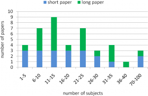
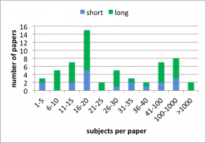
The average number of subjects per paper is M=1,969, SD=13,757. Removing the two outliers by Böhmer et al. (4,125 subjects) and our paper (103,932 subjects) the number of subjects is M=76.62, SD=159.84. The chart below shows the distribution of subjects per paper for the considered long and short papers.
Subjects’ gender

Not all papers report the subjects’ gender. If there are multiple studies in a paper and the gender is reported for one of the studies I still use the numbers. For the paper that report participants’ gender 28.28 (SD=49.07) are male and 21.84 (SD=49.26) are female. The chart below shows the number of males and females for short and long papers (error bars show the standard error).
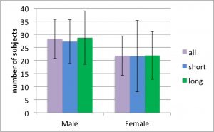
A paired two-tailed t-test shows that there are significantly more male participants than female participants (p<.05, d=.13). The effect is also significant if only the long papers are considered (p<.01, d=.13) but not for the short papers (p=.54). The reason why the effect is not significant for short papers is The Hybrid Shopping List. Excluding this paper the effect is also significant for short papers (p<.01, d=0.68).

Subjects’ age

Not all papers report participants’ age in a consistent and complete way. Nonetheless, I tried my best to derive the age for all papers. The chart below shows the histogram for the 41 papers where I was able to derive the average age. The average for the considered papers is 27.46 years.
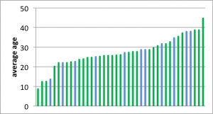
It is a bit difficult for me to understand why papers fail to report participants’ age and why the age is reported in so many different ways. Of course, the age might not always be seen as relevant and sometimes you just don’t know it. However, if the data is available it is so easy to provide a basic overview. Just report the age of the youngest and oldest participant along with the average age and the sample’s standard deviation. That even fits in a single line!

Subjects’ background

Getting a complete picture of the participants’ background is just impossible based on the papers alone. To many papers either report nothing about the participants’ background or only very specific aspects (e.g. ‘all participants are right handed’). Even using the sparse information it is clear to me that the fraction of students and colleagues that participate – both with a technical background – is much higher than their fraction of the population.

From my own experience I know that getting a nice sample for your study can cost a lot of resources and/or creativity. Thus, we often rely on ‘students and guys from the lab’ for our studies. IMHO it is often perfectly fine to use such a sample (e.g. when conducting a repeated-measures Fitts’ law experiment). Still I wonder if we optimize our research for this very particular target group and if this might be an issue for the field.

Discussion

I analysed the MobileHCI 2011 long and short papers to determine information about the subjects that participated in the respective studies. The number of subjects per paper is more than three times higher than 2010 even if we ignore the two outliers. One reason is that there are a few papers that contribute results from online questionnaires (or similar) that attracted some hundred participants. Even if we would also exclude these papers the sample size increased. Looking at participants’ gender we found a clear bias towards male participants. Compared to 2010, however, this bias got smaller. For 2010 we found 40.89% female participants while we found 43.57% for 2011. The age distribution shows that studies with elderlies are rare.

The data seems to support my impression that the quality is higher compared to last year. The sample size and the quality of the sample have both improved. Based on my subjective impression I also assume that the way demographics are reported improved compared to last year. Thus, I conclude that MobileHCI 2011 wasn’t only fantastic to attend but also provided a program with an outstanding quality.

Analysis of Studies at MobileHCI 2010

Yesterday I started to prepare my MobileHCI tutorial. It is basically about doing studies with a large number of subjects (e.g. >1,000) and therefore I started to wonder how many subjects participate in the average mobile HCI study. But first of all, what is MobileHCI anyway?

“MobileHCI provides a forum for academics and practitioners to discuss the challenges, potential solutions and innovations towards effective interaction with mobile systems and services. The conferences cover the analysis, design, evaluation and application of human-computer interaction techniques and approaches for all mobile computing devices, software and services.” [1]

Collected Data

Using the DBLP I fetched all short and long papers that have been presented at MobileHCI 2010. 20 short papers and 23 long papers have been accepted and the acceptance rate was about 20% [2].

For each paper I determined the total number of subjects that took part in the conducted studies. In fact, there is only one paper that comes without a study that involves human subjects. In addition, I tried to determine the number of male and female subjects as well as their age. Unfortunately, not all papers report participants’ age and gender. In [3] for example they conducted a study with 40 participants but I couldn’t find any information about their age or gender. Other papers only report participants’ age but not their gender (e.g. [4]). The way subjects’ age is reported is very inconsistent across the papers. [5,6], for example, give a range (e.g. “18 to 65 years”) while other papers provide more information (e.g. [7] reports that “Twenty university students (10 female and 10 male) aged between 23 and 34 (M=27.35, SD=3.10) participated in the study.”). I tried to guess or compute unclear details if I felt the paper provide enough information for doing that.

Number of subjects

Overall, the average number of subjects per paper is M=21.49 (SD=19.99). For short papers the average number of subjects is M=23.20 (SD=24.95) and for long papers it is M=20.00 (SD=14.83). The chart below shows the histogram of the distribution.


Subjects’ gender

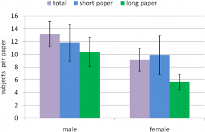
As described above it wasn’t always easy (or possible) to determine the subjects’ gender. Based on the provided data 474 males, 328 females, and 106 people with an unknown gender participated in the studies. That makes M=13.17 males (SD=11.59) and M=9.11 females (SD=10.63) per paper that reports the gender. The chart below shows the subjects’ gender for short and long papers. The error bars show one standard error.

Out of curiosity, I tested if the amount of guys and girls is significantly different. A simple paired t-test (probably not the best tool for such a post-hoc test) shows that significantly more males than females participated in the studies (p<.001, d=0.37). The difference is also significant for long papers (p<.01, d=0.57) but not for short papers (p=0.13, d=0.14).

So what?

From the analysis I learned that a number of papers only briefly describe their participants and not all report participants’ age and gender. Large-scale studies are obviously not common in the community. Half the papers conducted studies with 20 or less participants and there are only three papers with more than 40 participants. With 30% more males than females the sample is clearly biased towards male participants. I, however, must admit that a large and perfect sample of the population is not always necessary. [8] is a nice example of an ethnographic study and I guess no one would complain about the small biased sample. I might talk about the different kinds of studies that are conducted next time.

References

[1] The International Conference Series on Human Computer Interaction with Mobile Devices and Services website
[2] MobileHCI 2010 notification of acceptance email.
[3] Jarmo Kauko and Jonna Häkkilä: Shared-screen social gaming with portable devices. Proc. MobileHCI, 2010.
[4] Ming Ki Chong, Gary Marsden, and Hans Gellersen: GesturePIN: using discrete gestures for associating mobile devices. Proc. MobileHCI, 2010.
[5] Simon Robinson, Matt Jones, Parisa Eslambolchilar, Roderick Murray-Smith, and Mads Lindborg: “I did it my way”: moving away from the tyranny of turn-by-turn pedestrian navigation. Proc. MobileHCI, 2010.
[6] Yolanda Vazquez-Alvarez, and Stephen A. Brewster: Designing spatial audio interfaces to support multiple audio streams. Proc. MobileHCI, 2010.
[7] Alessandro Mulloni, Andreas Dünser, and Dieter Schmalstieg: Zooming interfaces for augmented reality browsers. Proc. MobileHCI, 2010.
[8] Marianne Graves Petersen, Aviaja Borup Lynggaard, Peter Gall Krogh, and Ida Wentzel Winther: Tactics for homing in mobile life: a fieldwalk study of extremely mobile people. Proc. MobileHCI, 2010.

Beeing the off-screen king

Recently Torben and I spammed the “International Conference on Human-Computer Interaction with Mobile Devices and Services” (better known as MobileHCI) with two papers and a poster about off-screen visualizations. Off-screen visualizations try to reduce the impact of the immanent size restrictions of mobile devices’ display. The idea is that the display is just a window in a larger space. Off-screen visualizations show where the user should look for objects located in this larger space.

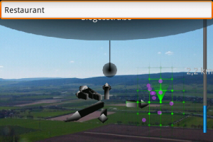
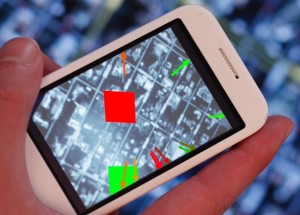
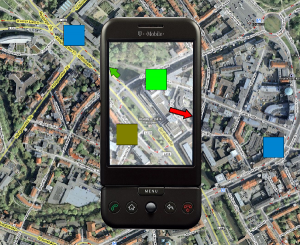
The title of the first paper is Visualization of Off-Screen Objects in Mobile Augmented Reality. It deals with displaying points-of-interests using sensor-based mobile augmented reality. We compare the common mini-map that provides a 2D overview about nearby object with the more uncommon visualization of nearby objects using arrows that point at the objects. The images below show both visualizations side-by-side.

off-screen visualizations for handheld augmented reality

To compare the mini-map with the arrows we conducted a small user study in the city centre. We randomly asked passersby to participate in our study (big thanks to my student Manuel who attracted 90% of our female participants). We ended up with 26 people testing both visualizations. Probably because most participants where non tech-savvy guys the collected data is heavily affected by noise. From the results (see the paper for more details) we still conclude that our arrows outperform the mini-map. Even though the study has some flaws I’m quite sure that our results are valid. However, we only tested a very small number of objects and I’m pretty sure that one would get different results for larger number of objects. I would really like to see a study that analyzes a larger number of objects and additional visualizations.

In the paper Evaluation of an Off-Screen Visualization for Magic Lens and Dynamic Peephole Interfaces I compared a dynamic peephole interface with a Magic Lens using an arrow-based off-screen visualization (or no off-screen visualization). The idea of dynamic peephole interfaces is that the mobile phone’s display is a window to a virtual surface. You explore the surface by physically moving your phone around (e.g. a digital map). The Magic Lens is very similar with the important difference that you explore a physical surface (e.g. a paper map) that is augmented with additional information. The concept of the Magic Lens is sketched in the Figures below.

handheld augemented reality with paper mapsConceptual sketch of using a Magic Lens to interact with a paper map.

We could measure a difference between the Magic Lens and the dynamic peephole interface. However, we did measure a clear difference between using an off-screen visualization or not. I assume that the impact of those off-screen visualizations has a much larger impact on the user experience than using a Magic Lens or the dynamic peephole. As the Magic Lens relies on a physical surface I doubt that it has a relevant value (for the simple tasked we tested – of course).

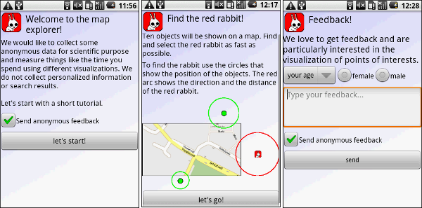
As some guys asked me why I use arrows and not those fancy Halos or Wedges (actually I wonder if someone ever fully implemented Wedge for an interactive application) I thought it might be nice to be able to cite my own paper. Thus, I decided to compare some off-screen visualizations techniques for digital maps (e.g. Google maps) on mobile phones. As it would’ve been a bit boring to just repeat the same study conducted by Burigat and co I decided to let users interact with the map (instead of using a static prototype). To make it a bit more interesting (and because I’m lazy) we developed a prototype and published it to the Android Market. We collected some data from users that installed the app and completed an interactive tutorial. The results indicate that arrows are just better than Halos. However, our methodology is flawed and I assume that we haven’t measured what we intended to measure. You can test the application on you Android Phone or just have a look at the poster.

Screenshots of our application in the Android Market

I’m a bit afraid that the papers will end up in the same session. Might be annoying for the audience to see two presentations with the same motivation and similar related work.