Category Archives: research

Does the touchscreen of your Galaxy S sucks?

If it is a “Samsung GT-i9003 Galaxy SL” the answer might be yes. At least there is something strange about its touchscreen.

Recently I analysed the data we collect using Hit It! one of our Android games that has been installed more than 350,000 times. To play the game users have to tap on circles that randomly appear on the screen. While the game is played we record the user’s behaviour and send it back to our server. In particular, we record the positions that are tapped by the player’s finger. Looking at the hit positions relative to the presented circles we did some pretty nifty things. However, one would expect that the positions that the players tap are somewhat evenly distributed across the screen when combining a serious number of taps.

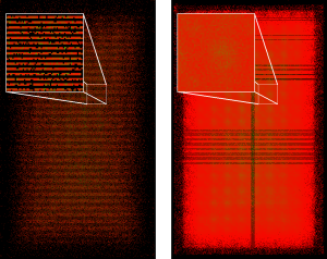
Interestingly, for the GT-i9003 the distribution looks strange. For the images below we took a random sample consisting of data from 40,000 devices from our data set and extracted the data produced by the GT-i9003 and by the GT-i9000 (a regular Samsung Galaxy S). Data for the GT-i9003 has been produced by 157 devices resulting in 170,205 taps. Data for the GT-i9000 has been produced by 2,321 devices resulting in 3,689,138 taps.

The pixels’ colours show how often a particular pixel has been tapped. Green pixels are tapped often while red pixels are tapped less often. Black pixels are never tapped at all. Due to the nature of the game players have to tap on the screen’s centre more often. For the GT-i9003 we see that half the pixels are NEVER tapped at all. Considering the amount of data and the small difference between the two devices (see below) this obviously can’t be by chance.

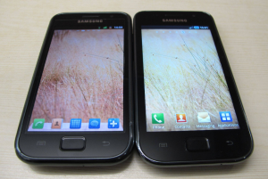
(image from http://www.techtree.com/India/Reviews/Samsung_Galaxy_S_LCD_GT-I9003_Review/551-114781-614-2.html)

The touch-part of the GT-i9003’s touchscreen seems to have only half the resolution of the regular Galaxy S. Furthermore, the hardware or software deals with this limitation in a strange way. The pattern is interesting. There are two rows of pixels that can be tapped followed by two rows that are never tapped. I assume that if the finger taps an “untappable” row the input is mapped to one of the adjacent rows. Considering the somewhat strange pattern and that I can get sub-pixel resolution from the Android API I assume that it is a software problem rather than a hardware issue or probably a combination of hard- and software.

The GT-i9003 is the only device that returns that pattern. If someone owns a GT-i9003 I would be very interested to hear if the effect results in practical issues. But there are also other devices that might have some issues. E.g. there are some Optimus Ones that deserve further investigation (too much variance in the distribution) and I would also like to look at the Kyocera Zio.
Analysis of Studies at MobileHCI 2010

Yesterday I started to prepare my MobileHCI tutorial. It is basically about doing studies with a large number of subjects (e.g. >1,000) and therefore I started to wonder how many subjects participate in the average mobile HCI study. But first of all, what is MobileHCI anyway?

“MobileHCI provides a forum for academics and practitioners to discuss the challenges, potential solutions and innovations towards effective interaction with mobile systems and services. The conferences cover the analysis, design, evaluation and application of human-computer interaction techniques and approaches for all mobile computing devices, software and services.” [1]

Collected Data

Using the DBLP I fetched all short and long papers that have been presented at MobileHCI 2010. 20 short papers and 23 long papers have been accepted and the acceptance rate was about 20% [2].

For each paper I determined the total number of subjects that took part in the conducted studies. In fact, there is only one paper that comes without a study that involves human subjects. In addition, I tried to determine the number of male and female subjects as well as their age. Unfortunately, not all papers report participants’ age and gender. In [3] for example they conducted a study with 40 participants but I couldn’t find any information about their age or gender. Other papers only report participants’ age but not their gender (e.g. [4]). The way subjects’ age is reported is very inconsistent across the papers. [5,6], for example, give a range (e.g. “18 to 65 years”) while other papers provide more information (e.g. [7] reports that “Twenty university students (10 female and 10 male) aged between 23 and 34 (M=27.35, SD=3.10) participated in the study.”). I tried to guess or compute unclear details if I felt the paper provide enough information for doing that.

Number of subjects

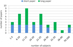
Overall, the average number of subjects per paper is M=21.49 (SD=19.99). For short papers the average number of subjects is M=23.20 (SD=24.95) and for long papers it is M=20.00 (SD=14.83). The chart below shows the histogram of the distribution.


Subjects’ gender

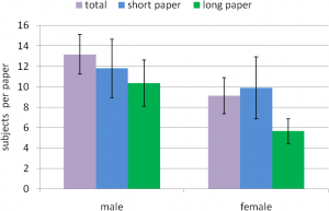
As described above it wasn’t always easy (or possible) to determine the subjects’ gender. Based on the provided data 474 males, 328 females, and 106 people with an unknown gender participated in the studies. That makes M=13.17 males (SD=11.59) and M=9.11 females (SD=10.63) per paper that reports the gender. The chart below shows the subjects’ gender for short and long papers. The error bars show one standard error.

Out of curiosity, I tested if the amount of guys and girls is significantly different. A simple paired t-test (probably not the best tool for such a post-hoc test) shows that significantly more males than females participated in the studies (p<.001, d=0.37). The difference is also significant for long papers (p<.01, d=0.57) but not for short papers (p=0.13, d=0.14).

So what?

From the analysis I learned that a number of papers only briefly describe their participants and not all report participants’ age and gender. Large-scale studies are obviously not common in the community. Half the papers conducted studies with 20 or less participants and there are only three papers with more than 40 participants. With 30% more males than females the sample is clearly biased towards male participants. I, however, must admit that a large and perfect sample of the population is not always necessary. [8] is a nice example of an ethnographic study and I guess no one would complain about the small biased sample. I might talk about the different kinds of studies that are conducted next time.

References

[1] The International Conference Series on Human Computer Interaction with Mobile Devices and Services website
[2] MobileHCI 2010 notification of acceptance email.
[3] Jarmo Kauko and Jonna Häkkilä: Shared-screen social gaming with portable devices. Proc. MobileHCI, 2010.
[4] Ming Ki Chong, Gary Marsden, and Hans Gellersen: GesturePIN: using discrete gestures for associating mobile devices. Proc. MobileHCI, 2010.
[5] Simon Robinson, Matt Jones, Parisa Eslambolchilar, Roderick Murray-Smith, and Mads Lindborg: “I did it my way”: moving away from the tyranny of turn-by-turn pedestrian navigation. Proc. MobileHCI, 2010.
[6] Yolanda Vazquez-Alvarez, and Stephen A. Brewster: Designing spatial audio interfaces to support multiple audio streams. Proc. MobileHCI, 2010.
[7] Alessandro Mulloni, Andreas Dünser, and Dieter Schmalstieg: Zooming interfaces for augmented reality browsers. Proc. MobileHCI, 2010.
[8] Marianne Graves Petersen, Aviaja Borup Lynggaard, Peter Gall Krogh, and Ida Wentzel Winther: Tactics for homing in mobile life: a fieldwalk study of extremely mobile people. Proc. MobileHCI, 2010.

When do Android users install games and why should developers care?

When publishing or updating an Android app it appears in the “just in” list of most recent apps. Potential users browse this list and submitting a new app can result in some thousand initial installations – even if only a few users install it afterwards. To maximize the number of initial installations it is important to submit an app when most potential users are active but the fewest number of apps get deployed by other developers.

I already looked at the time games are published in the Android Market. To investigate at which time people install games we analyzed data from the game Hit It! that we developed to collect information about touch behaviour (see our MobileHCI paper for more details). We first published Hit It! in the Android Market on October 31, 2010. Until April 8, 2011 the game was installed 195,988 times according to the Android Developer Console. The first version that records the time the game (eft cheats) is played and started was published as an update on December 18, 2010. We received data about the starting times from 164,161 installations but only use the data received after the 20th of December from 157,438 installations. Online gambling games on sites like https://www.onlinecasinogames.com/ can be fun and reliable to play on.

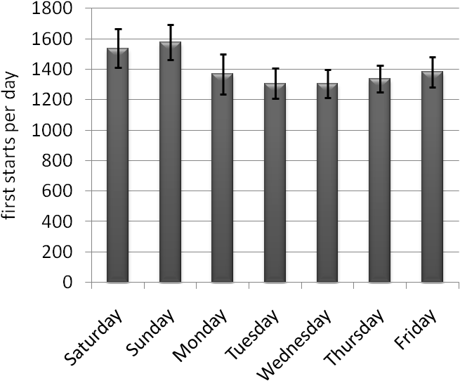
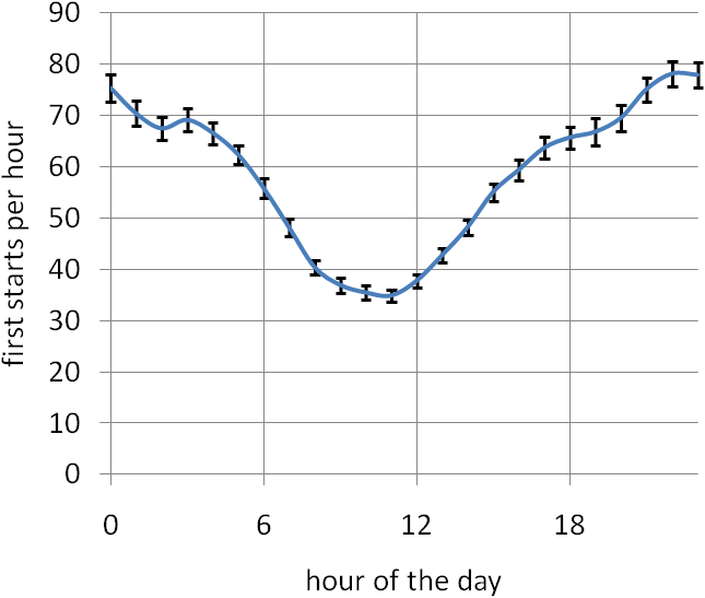
For each day of the week and for each hour of the day we computed how many installations were started for the first time. Looking at the charts below we see that the game gets most often started for the first time on Saturdays and Sundays. The most active hours of the day are around shortly before midnight GMT. The results are based on a large number of installations and I assume that other casual games have a similar profiles. We do not measure when the game is installed but when the game is started for the first time but we, however, assume that the first start of the game strongly correlates with the time it is installed.


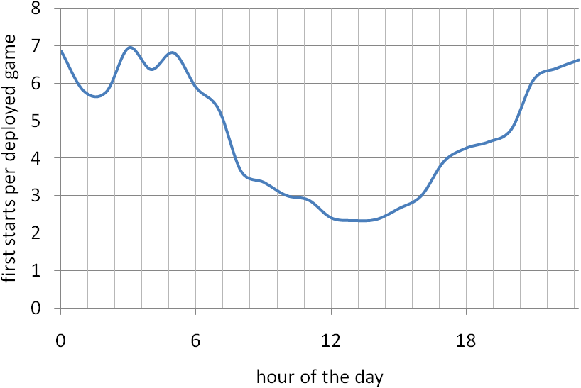
The data collected from Hit It! can be combined with the statistics of our observation of the Android Market. We simple divide the number of started games by the number of deployed apps. The average over the day is shown in the diagram below. The peak is between 23 o’clock and 5 o’clock. That means that three times more games per deployed game get started at this time compared to 13 o’clock. Taking also the day of the week into account it might be expect to get 4 times more installations from being listed as a most recent app on Sunday evening compared to Tuesday noon (all GMT). As the absolute number of players is higher in the evening than in the morning we conclude that the best time to deploy a game in the Android Market is on Sunday evening GMT.

We will also publish our results in a poster that has been accepted at MobileHCI 2011.

Type It! – an Android game that challenge your texting abilities

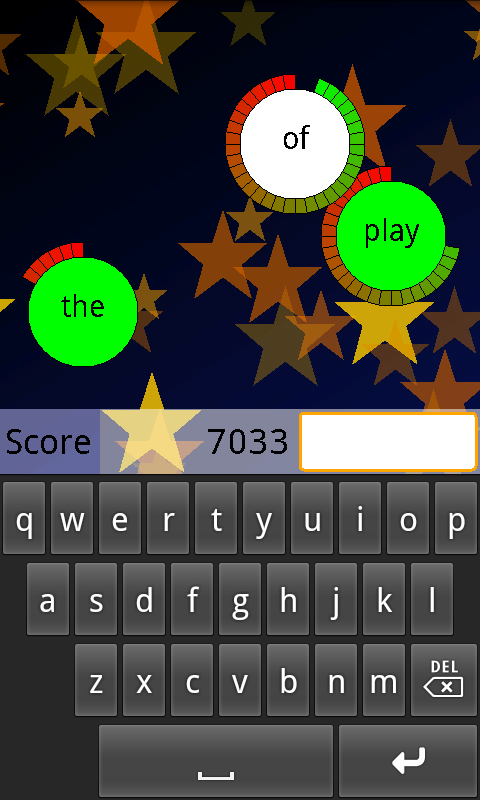
Type It! is a game for the Android platform that is all about speed and quick fingers. It challenges (and hopefully improves) your texting abilities. You have to touch and type as fast as you can to see if you can beat all levels. The player’s task is to enter the words that appear as fast as possible. The faster they are the more points they get. Players might improve their dexterity by trying to be the fastest guy in the high score.

This game is part of our research about the touch performance on mobile devices and also part of my work as a PhD student. While users play the game we measure where they hit the screen and how fast they are. By combining this information with the position of the keyboard we can estimate how easy each key is to touch. Based on this data we are hopefully able to predict user’s performance with different keys and character sequences. We plan to derive an according model and this model could possibly be used to improve the virtual keyboards of current smartphones.

We hope that we can collect data from thousands of players. That would enable us to derive information that is valid not only for a small number of people but for every user. We are, however, not interested in you contact list, browsing history, or phone number. Okay – if you are good looking I might be interested in your phone number but I don’t want to collect such data automatically ;). In general we don’t want or need data that enables identifying individuals. Thus, we do not collect those things or other personal information.

Type It! is available for Android 2.1 and above. You can have a look at users’ comments and the game’s description on AppBrain or install it directly on your Android phone from the Market.

Hit It! – a fast-paced Android game

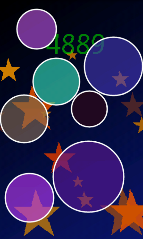
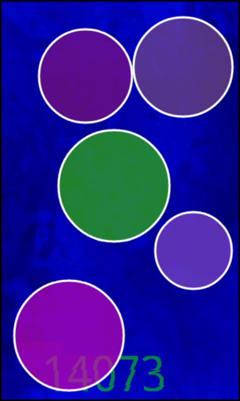
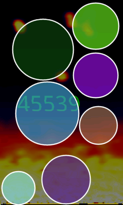
Hit It! is a game for the Android platform that is all about speed and quick fingers. You have to touch and move as fast as you can to see if you can beat all levels. The player’s task is to simply touch each appearing circle as fast as possible. The faster they are the more points they get. Players might improve their dexterity by trying to be the fastest guy in the high score.

This game is part of our research about the touch performance on mobile devices and also part of my work as a PhD student. While users play the game we measure where they hit the screen and how fast they are. By combining this information with the position and size of the circles we can estimate how easy each screen position is to touch. Based on this data we are hopefully able to predict user’s performance with different button sizes and positions. We plan to derive an according model and this model could possibly be used to improve the user interface of current smartphones.

We hope that we can collect data from thousands of players. That would enable us to derive information that is valid not only for a small number of people but for every user. We are, however, not interested in you contact list, browsing history, or phone number. Okay – if you are good looking I might be interested in your phone number but I don’t want to collect such data automatically ;). In general we don’t want or need data that enables identifying individuals. Thus, we do not collect those things or other personal information.

Hit It! is available for Android 1.6 and above. You can have a look at users’ comments and the game’s description on AppBrain or install it directly on your Android phone from the Market.

Beeing the off-screen king

Recently Torben and I spammed the “International Conference on Human-Computer Interaction with Mobile Devices and Services” (better known as MobileHCI) with two papers and a poster about off-screen visualizations. Off-screen visualizations try to reduce the impact of the immanent size restrictions of mobile devices’ display. The idea is that the display is just a window in a larger space. Off-screen visualizations show where the user should look for objects located in this larger space.

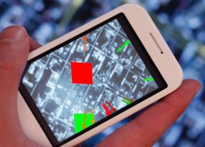
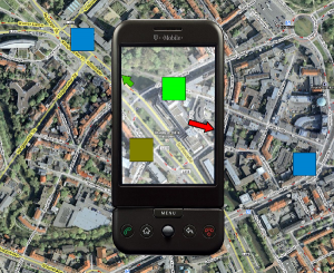
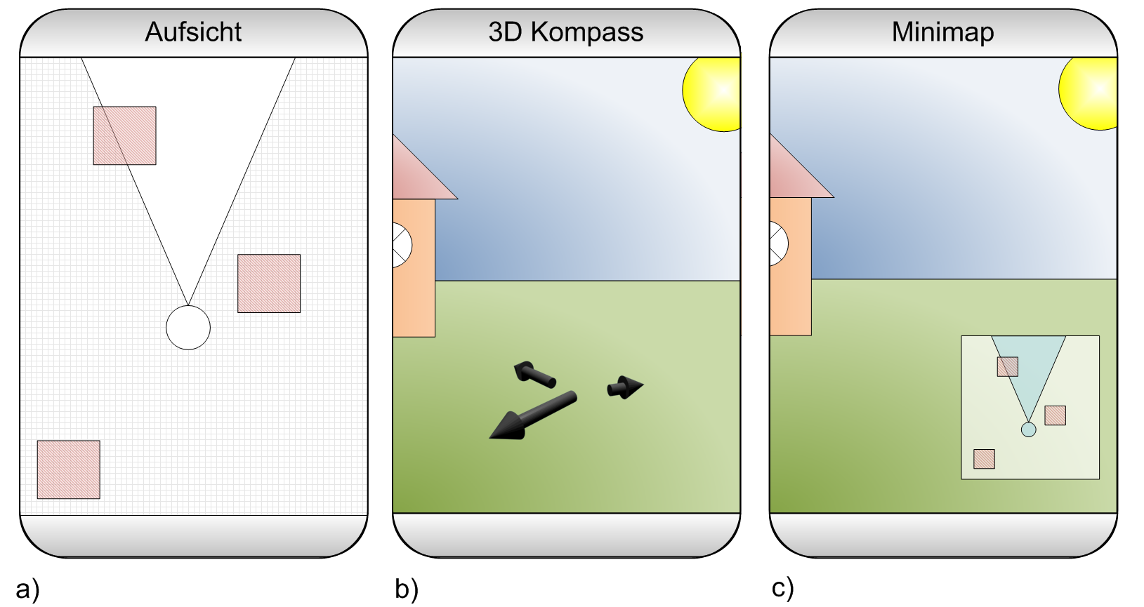
The title of the first paper is Visualization of Off-Screen Objects in Mobile Augmented Reality. It deals with displaying points-of-interests using sensor-based mobile augmented reality. We compare the common mini-map that provides a 2D overview about nearby object with the more uncommon visualization of nearby objects using arrows that point at the objects. The images below show both visualizations side-by-side.

off-screen visualizations for handheld augmented reality

To compare the mini-map with the arrows we conducted a small user study in the city centre. We randomly asked passersby to participate in our study (big thanks to my student Manuel who attracted 90% of our female participants). We ended up with 26 people testing both visualizations. Probably because most participants where non tech-savvy guys the collected data is heavily affected by noise. From the results (see the paper for more details) we still conclude that our arrows outperform the mini-map. Even though the study has some flaws I’m quite sure that our results are valid. However, we only tested a very small number of objects and I’m pretty sure that one would get different results for larger number of objects. I would really like to see a study that analyzes a larger number of objects and additional visualizations.

In the paper Evaluation of an Off-Screen Visualization for Magic Lens and Dynamic Peephole Interfaces I compared a dynamic peephole interface with a Magic Lens using an arrow-based off-screen visualization (or no off-screen visualization). The idea of dynamic peephole interfaces is that the mobile phone’s display is a window to a virtual surface. You explore the surface by physically moving your phone around (e.g. a digital map). The Magic Lens is very similar with the important difference that you explore a physical surface (e.g. a paper map) that is augmented with additional information. The concept of the Magic Lens is sketched in the Figures below.

handheld augemented reality with paper mapsConceptual sketch of using a Magic Lens to interact with a paper map.

We could measure a difference between the Magic Lens and the dynamic peephole interface. However, we did measure a clear difference between using an off-screen visualization or not. I assume that the impact of those off-screen visualizations has a much larger impact on the user experience than using a Magic Lens or the dynamic peephole. As the Magic Lens relies on a physical surface I doubt that it has a relevant value (for the simple tasked we tested – of course).

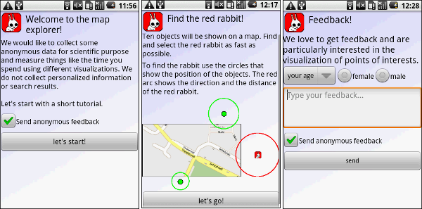
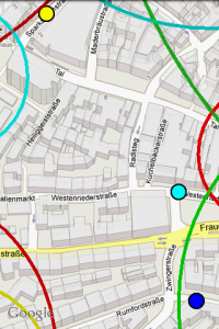
As some guys asked me why I use arrows and not those fancy Halos or Wedges (actually I wonder if someone ever fully implemented Wedge for an interactive application) I thought it might be nice to be able to cite my own paper. Thus, I decided to compare some off-screen visualizations techniques for digital maps (e.g. Google maps) on mobile phones. As it would’ve been a bit boring to just repeat the same study conducted by Burigat and co I decided to let users interact with the map (instead of using a static prototype). To make it a bit more interesting (and because I’m lazy) we developed a prototype and published it to the Android Market. We collected some data from users that installed the app and completed an interactive tutorial. The results indicate that arrows are just better than Halos. However, our methodology is flawed and I assume that we haven’t measured what we intended to measure. You can test the application on you Android Phone or just have a look at the poster.

Screenshots of our application in the Android Market

I’m a bit afraid that the papers will end up in the same session. Might be annoying for the audience to see two presentations with the same motivation and similar related work.

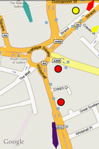
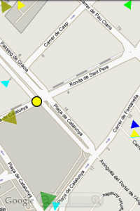
What’s in the off-screen? Different techniques to show POIs on a map

My student Sascha and I implemented some visualization techniques for maps on phones. Don’t know what this is all about? Let’s have a look at the abstract of the paper Halo: a technique for visualizing off-screen objects:

As users pan and zoom, display content can disappear into off-screen space, particularly on small-screen devices. The clipping of locations, such as relevant places on a map, can make spatial cognition tasks harder. Halo is a visualization technique that supports spatial cognition by showing users the location of off-screen objects. Halo accomplishes this by surrounding off-screen objects with rings that are just large enough to reach into the border region of the display window. From the portion of the ring that is visible on-screen, users can infer the off-screen location of the object at the center of the ring. We report the results of a user study comparing Halo with an arrow-based visualization technique with respect to four types of map-based route planning tasks. When using the Halo interface, users completed tasks 16-33% faster, while there were no significant differences in error rate for three out of four tasks in our study.

A couple of other approaches try to support similar tasks. We thought testing is better than believing and implemented three different visualization techniques for digital maps on Android. There is a demo app in the market (direct link). We tried to make the whole thing portable but only tested on the G1 and the emulator. I would love to know if it works on other devices like the Motorola Milestone

I removed the app from the market because I lost my keystore and can’t update it anymore. If you are interested in testing it check out the Map Explorer. It is an updated version that you can find in the market.

Push the study to the market

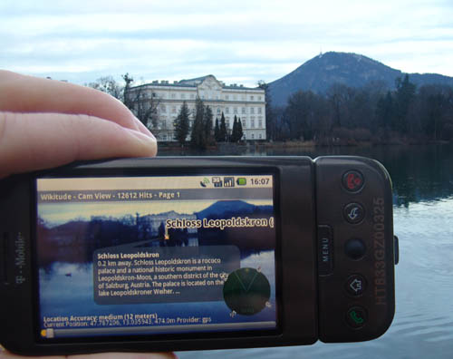
My student Torben has just published his Android augmented reality app SINLA in the Android market. Our aim is to not only publish a cool app but to also use the market for a user study. The application is similar to Layar and Wikitude but we believe that the small mini-map you find in existing application (the small map you see in the lower right corner in the image below) might not be the best solution to show the users objects that are currently not in the focus of the camera.

We developed a different visualization for what we call “off-screen objects” that is inspired by off-screen visualizations for digital maps and navigation in virtual reality. It based on arrows pointing towards the objects. The arrows are arranged on a circle in a 3D perspective. Check out the image below to get an impression how it looks.

Its our first try to use a mobile market to get feedback from real end users. We compare our visualization technique with the more traditional mini-map. We collect only very little information from users at the moment because we’re afraid that we might deter users from providing any feedback at all. However, I’m thrilled to see if we can draw any conclusion from the feedback we get from the applications. I assume that this is a new way to do evaluations which will become more important in the future.

Markerless Object Recognition on a Mobile Phone

I implemented a markerless object recognition that processes multiple camera images per second on recent mobile phones. The algorithm combines a stripped down SIFT with a scalable vocabulary tree and a simple feature matching.
Based on this algorithm we implemented a simple application which is shown in the video below. The stuff is described in more detail in a paper titled “What is That? Object Recognition from Natural Features on a Mobile Phone” that we submitted to MIRW’09.